Definition and Structure
1. What are design tokens?
Design tokens are the smallest units that store the visual guidelines and design decisions that characterize our system. More importantly, tokens document the intended context of use assigned to a specific style, and enable the application of the correct visual value to a specific component property. This is how tokens help to bridge the gap between implementation and design.
Tokens are used to:
Define the visual style of components: since tokens capture the system’s stylistic attributes, they provide guidance to define the styles (background colors, text formatting, sizes, spacing…) of new system components from scratch.
Codify design styles: Designers use tokens to specify all the visual styles and interactive properties of a given component. These design decisions are translated to code. For more details regarding the use of design tokens for design specification, refer to the section dedicated to specification hand-off to development in the Designing Components documentation.
From visual styles to tokens in design and code
Design system components are made up of a combination of predefined perceptual patterns. These patterns result from the consistent application of preselected styles such as colors, shadows, or spacing values, to specific UI elements and properties like backgrounds, borders, or paddings.
At its core, Atlas is made up of a set of visual styles derived from the style guide principles. Colors, typography, shadows and spacings are aligned with the style guide, and documented as tokens in the system. Design tokens are thus the smallest building blocks of the system: they define, document and enable the application of systemic design decisions at scale.
Token typologies
There are three types of tokens, depending on their function and level of abstraction:
global tokens
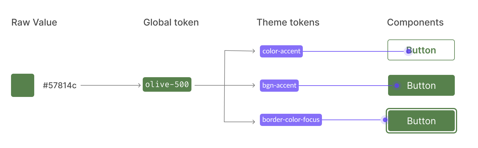
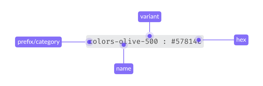
Option tokens are context-agnostic tokens that encapsulate the primitive visual foundations of the system. Their name does not reflect a specific use case, rather they use the simplest possible name. They have raw values, e.g. olive-500: #57814c
Global tokens are not used to style components. Their only purpose is to document raw values, and to be consumed by the next token typology: theme tokens.
Prefix only in Figma
In Figma, Colors and Typography are used as prefixes to organize design tokens, but these prefixes are typically removed when the tokens are transformed into CSS variables
Theme tokens
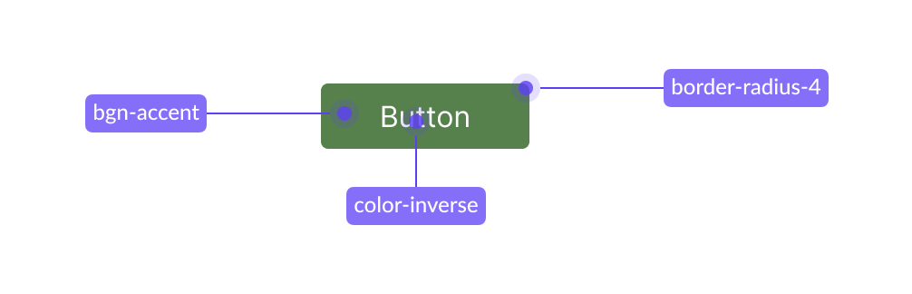
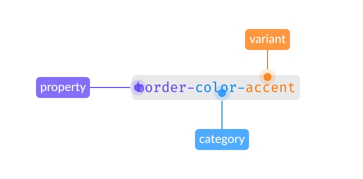
Theme tokens consume global tokens as values. They represent design decisions that can be reused to style system components. For this reason, theme tokens are documented in our Theme token demo. They communicate their intended use case via their name (so are not agnostic, like option tokens), e.g. border-color-accent.
Decision tokens are used to style system components and elements.
Component decision tokens
In the context of Atlas, component tokens are used to document and define specific component styles that cannot be documented as shared decisions due to their single-use application. The names of component tokens include the name of the specific component and the property they define. Like decision tokens, they consume option tokens as values, e.g. color-link-visited: purple-600.
Component tokens embody exceptions, and are directly applied to style specific component properties. If a pattern arises (i.e. the component token can be used by several components), the single-use component token can be converted into a theme token.
2. Tokens in design
From design to implementation
Designers can access an overview of Atlas foundational styles and principles, along with their token translation, in the Atlas Figma library. By enabling this library in their project’s Figma files, designers can reuse the Atlas visual principles as Figma styles and variables when creating components and compositions.
INFO
Please note that tokens are context-specific: use them accordingly to the intended purpose expressed by their name. E.g. Apply content colors only to text.
During implementation, engineers will be able to follow the design specifications in Figma (whether these are presented explicitly, or via the Inspect panel) and use the correct design tokens as values of the component’s CSS properties.
Please find all current design system token category demos in this section of the Atlas docs, starting at Border and ending at Spacing.